Did you know that app store screenshots can help you increase conversions for your mobile game?
You heard that right – this ASO element is powerful enough to convince people to pull the trigger.
However, you need to do it right and optimize your app store images.
Learn all about designing the perfect app store screenshots for mobile games in this extensive guide!
Why Are App Store Screenshots Important for ASO?
App store optimization refers to the process of increasing organic app conversions and ranking higher in app stores. It includes optimizing various elements like an app’s name, icon, app keywords, descriptions, and visual gallery.
The visuals publishers can add to their app pages are screenshots and an app promo video. Oftentimes, visuals are more effective than words in communicating messages and influencing people’s decisions. That’s particularly true for mobile games – the best way to show users what it’s like to play a game is through visuals.
That’s what makes screenshots and the promo video essential for ASO.
According to Storemaven, an optimized Apple App Store gallery can increase the conversion rate by up to 40%.
Screenshots are particularly important for the exploring visitors, i.e., those who will first browse through the content on your app store page before making the final decision.
And remember that people who click on your ads also end up on your app store page. So, captivating screenshots are not only important for organic conversions but paid user acquisition campaigns as well and should have a place in your overall app marketing strategy.
10 Tips for Designing App Store Screenshots That Boost Downloads
I’ve put together the most comprehensive practical guide for designing app store screenshots for mobile games. By following these tips, you’ll make professional-looking screenshots in no time!
Check it out below.

1. Check Out Competitors’ Screenshots
Before you start designing, you need to do some good ol’ research. Primarily, I’m talking about spying on your competitors. Luckily, you don’t have to be a secret agent to do this. Simply head on over to Google Play and Apple’s App Store and search for popular games in your genre. You can also use mobile intelligence platforms for this type of research.
Then, take a look at competitors’ screenshots and ask yourself these questions:
- What kind of a story are the screenshots telling?
- How are the screenshots representing those games?
- What kind of themes are present?
- Are the screenshots visually appealing and eye-catching? Why?
- What kind of art style is used? What about colors?
- Are there captions? What messages are they portraying?
- Do the screenshots make you download that game?
By answering these questions for your competitors’ screenshots, you’ll get a pretty good idea of how effective they are and why.
Now you know what you’re up against – this is the starting point. Next, you need to figure out how to be better than the competition and stand out from thousands of mobile games in the stores.
2. Choose the Right Orientation
The choice between landscape and portrait screenshot orientation is seemingly simple, but don’t be fooled – it’s more important than you think.
The main benefit of portrait screenshots is the ability to showcase multiple features at once, as users can see several screenshots without scrolling. Landscape screenshots, on the other hand, put focus on one main message.
Most mobile apps (95% of them according to Storemaven) tend to go with portrait orientation for images. One of the main reasons for it is that apps usually don’t support horizontal use. Furthermore, portrait orientation allows apps to showcase multiple features at once.
When it comes to mobile games, the situation is quite different. According to Storemaven, 63% of mobile games use landscape orientation. That makes sense, as many mobile games support horizontal play.

Landscape Orientation
We recommend using landscape orientation if your mobile game has horizontal UI, and strong brand recognition (doesn’t have to rely on multiple messages). Furthermore, use this orientation if your target audience is mid-core and hardcore gamers who are accustomed to horizontal gameplay.

Portrait Orientation
Use portrait orientation if your mobile game is complex, requires more explanation, and has a vertical UI. Furthermore, vertical orientation is preferable for games in competitive categories like match-3 or casino because these games need to present several unique features to convince users to download it. Additionally, portrait orientation seems to work better if your target audience is casual players.
However, keep in mind that games oftentimes have a hybrid approach and showcase both landscape and portrait screenshots.
The best way to know for sure what works for your game is to A/B test different orientations.
3. Pick a Screenshot Style That’s Suitable for Mobile Games
If you browse through apps and games in the app stores, you’ll notice there are many different screenshots styles.
For example, screenshots for apps usually demonstrate how it solves a specific problem. Furthermore, many apps use lifestyle screenshots where the app is showcased in a real-life setting and shows users how to use it. However, this style is not the best option for mobile games, as they’re used primarily for entertainment.
Here’s a list of the most popular screenshot styles that are suitable for games.

Screenshots Showcasing Features
Screenshots for mobile games most commonly depict the top features and benefits of a game. For example, the images can depict the ability to build cities, fight enemies, play with friends, and compete in live events. Usually, it’s one feature/benefit per screenshot and it comes with a caption. More on captions later in the article.
The goal here, of course, is to differentiate your game from other games in the genre. In other words, highlight unique features or benefits that place you above the competition.

Gameplay-Focused Screenshots
If you take a screenshot of the game while it’s being played, that’s a gameplay screenshot. If done right, this type of screenshot style can create interest in your game. Another benefit of this style is that players get to see what the game looks like and know what to expect once they install it.
Make sure to capture the screenshot at the right time, i.e., at the most exciting game moments. For example, a final boss fight or an adrenaline-fueled tournament.

Screenshots That Feature Game Characters
Out of all game elements, players connect with game characters the most. Furthermore, game characters are usually the most recognizable part of a mobile game.
Because of that, many publishers go with character-focused screenshots.
If your game has a main character that drives the story, or the game’s mascot is the main reason why people download your game, you should go with this screenshot style.
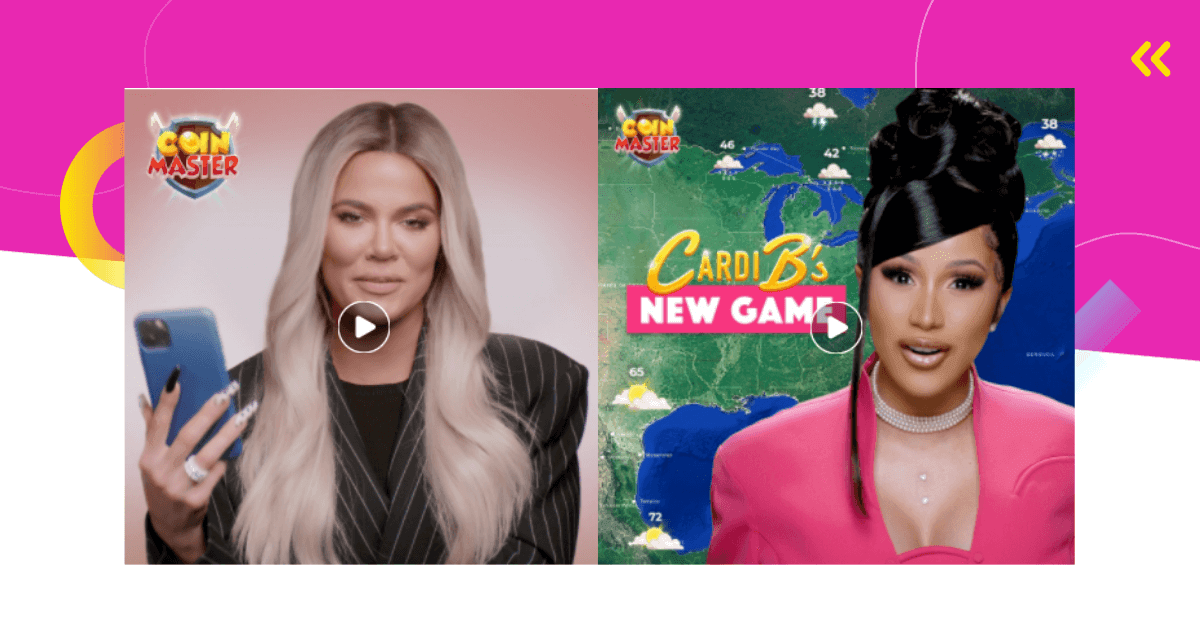
Moreover, this is a particularly smart choice for popular IPs with good brand recognition. For example, games like Moon Active’s Coin Master, Rovio’s Angry Birds, or Outfit7’s My Talking Tom, all of which have popular and widely known game characters.

Artistic Screenshots
If you want to do your own thing and wow users with something unique, go ahead and create a custom artistic design for your screenshots. You can take visuals from the game and combine them with other design elements to create a screenshot that stands out.
For example, splash screens are a very popular artistic screenshot style.
However, don’t get lost in your artistic creation. Make sure it’s still clear what the game is about and emphasize its USP.
Hybrid Screenshots
Can’t decide which style to go with? Well, why not do a bit of everything and combine these different approaches.
4. Try a Panoramic Gallery
Another cool way to design app store screenshots is to create a panoramic gallery. This style includes a design that spans more than one screenshot. The goal is for the screenshots to appear as one continuous image.
Panoramic screenshots look very cool, they’re eye-catching and encourage users to keep scrolling through the images. That’s what makes them so desirable.
Even though this type of design might look complicated at first glance, it’s actually not that hard to make. The key is in considering the gap between the images to make it seamless.

5. Keep Basic Design Principles in Mind
Here’s the thing.
App store screenshots should follow the same basic graphic design principles as any other graphic or image. For example, composition, contrast, repetition, emphasis, proportion, etc.
That means the image’s composition needs to be balanced and all elements need to be aligned and in harmony. Furthermore, elements you want to highlight should be emphasized and have extra visual weight, which is also known as hierarchy in graphic design. Use repetition (consistent use of the same colors, fonts, or shapes) to tie all the screenshots together and make them look cohesive.
Don’t forget to make the design in line with your brand identity. If you’re a well-known publisher, your screenshots should be instantly recognizable. However, if you’re just starting out, screenshot designs are a great way to start building a distinct brand identity.
If you’ve published multiple games, especially if they’re in the same category, it’s a good idea to have a similar screenshot design for all of them. For example, Playrix’s screenshots for Homescapes, Gardenscapes, and Fishdom have the exact same design. Even the screenshots and showcased features are very similar. Only the color scheme is a bit different from game to game.

6. Choose the Right Color Palette
The importance of color in design comes from the importance of color to the human mind. Colors have the power to communicate ideas, make us feel certain emotions, or spark our interest.
Because of that, the color palette you choose is one of the most critical parts of app store screenshots.
If you have no idea which colors to use, start with the color scheme of your game and overall brand. Oftentimes, the best choice is to stick with those colors. However, you can experiment with adding additional shades to create emphasis or contrast in the screenshot design.

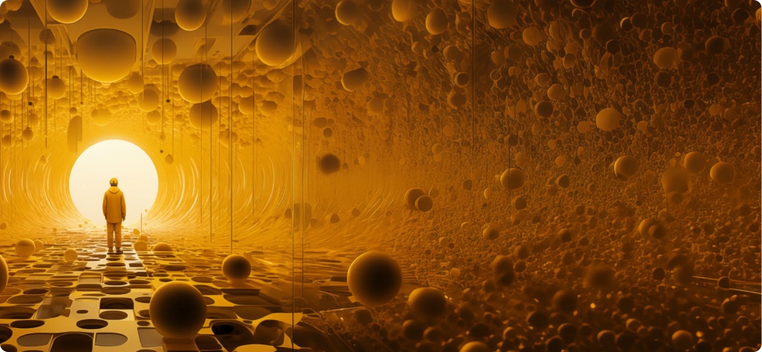
Let’s say the main colors in your game’s color palette are medium-dark brown, dark cyan, yellow-orange, and orange-red. You can use them as base colors for the screenshots and add a darker shade to create contrast and make the screenshot more eye-catching. For example, a shade like midnight blue, dark purple, hunter green, or rich black works great with these base colors, as you can see in the image above.

7. Add Captions to Screenshots to Highlight Features
Most app store screenshots have text, i.e., captions that highlight the game’s best features or benefits. Furthermore, they oftentimes speak directly to the user.
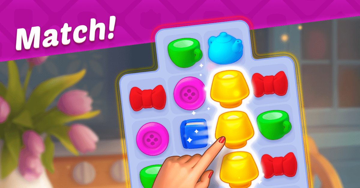
For example, if you have a screenshot of match-3 puzzle gameplay, the caption might say, “Solve match-3 puzzles” or “Match!” or simply “Play”.
Make sure to emphasize your game’s USP, i.e., let people know which features make it different, more exciting, or simply better than the rest.
For example, captions on Toon Blast’s screenshots are “Blast the cubes”, “Fun puzzles”, “Enjoy boosters”, “Collect new items”, “Earn rewards”, and “5000+ levels”.
Additionally, ensure the captions are easily legible, short and to the point, and deliver the desired message. Don’t forget that the captions’ font should follow your brand identity.

8. Capture Attention with Additional Design Elements
App Store images often benefit from additional visual elements that enrich the design. For example, you can create a frame for the gameplay screenshot, add a background, or other graphics. Their purpose is to deliver additional messages, emphasize the caption, or simply complement the overall design.
You can see a cool example of using additional design elements in the image above. This screenshot is for Pokémon UNITE. It’s done in an artistic style – there’s no actual gameplay screenshot, but rather a digital drawing depicting an action-packed scene featuring the main characters.
On the left, you’ll notice several elements that were added to this design to make it more dynamic, most importantly the trophy. The golden trophy has a Google Play logo in it because Pokémon UNITE has been named the best game in Google Play’s Best of 2021 awards. This is a great example of how to deliver more information with a screenshot by adding additional visual elements.
Another thing you can do is add your logo to make your brand more recognizable. However, make sure that you don’t go overboard and make the design too busy. A simple and streamlined design is usually the best one.

9. If You’re Struggling, Purchase an App Store Screenshots Template
If you’re not that keen on designing your own images from scratch, you might benefit from purchasing an app store screenshots template.
This makes the whole process so much easier – the only thing you need to do is customize the template.
Search for app store screenshots templates in different stores like Envato Elements and Creative Market. Most commonly, the app store screenshots templates you purchase are built with Figma. That means that graphic elements, colors, and sizes can be adjusted.
The downside of going with an app store screenshots template is that your screenshots won’t be 100% unique, as other publishers might also use the same template. Furthermore, you might not be able to find a template that suits your specific needs.
10. Try an App Store Screenshot Generator
Now, if you don’t want to design your own images from the ground up or purchase a template, there’s one more option left – try an app store screenshot generator.
With this type of tool, you can create and export screenshots in minutes. Top app store screenshot generators tend to offer templates and layouts based on popular apps, which simplifies the design process. Furthermore, these tools usually allow you to export your images in all required sizes. Some even offer advanced features like localization and panoramic backgrounds.
Here’s a list of some of the most popular app store screenshot generator tools:
- AppScreens
- net
- AppLauchpad
- com
- AppMockUp
For a breakdown of the top app store screenshot generators and other tools, click here.
BONUS TIPS
Need even more advice on how to design the perfect screenshots and excel at app store optimization? Here are three bonus tips.

1. Localize Your Screenshots
Publishers want to reach as many players as possible. For that reason, most mobile games are released in multiple different countries around the globe.
To make your mobile game appealing to different audiences, you need to localize your screenshots and other ASO elements. It makes sense – if you want players from China to download your game, all messages need to be translated into their language.
However, localization is not only about translation – that’s just the very minimum.
True localization is about adapting all your content for another culture. Even parts of your design that you might think are universal, like color, for example, might provoke a different response in different cultures.
2. Use Different Screenshots for Google Play and Apple’s App Store
You might think that you can simply take the same set of screenshots and post them on both Google Play and Apple.
Two birds with one stone, right?
Well, technically, you can use the same screenshots for all stores, but that doesn’t mean you should.
Here’s the thing.
Google Play and Apple Store are two very different platforms and you should approach them as such. For example, the store designs, image resolutions, and features are very different. Not to mention each store has a different audience with different preferences.
Because of that, an ASO strategy that works for Google might not work for Apple or vice versa.
To ensure you come out on top on all app stores, avoid using the same screenshots, but rather adapt your design for each store.

3. Choose the Right Screenshot Order
This might seem obvious, but it’s worth mentioning. The screenshots order you choose plays a big part in how users will receive your game. Such a simple thing of choosing which screenshots go first can make the difference between a user installing your game and losing interest.
As with everything else, you should try to make a good first impression. Keep in mind that most users won’t scroll through all images. Because of that, screenshots that depict features your target audience would find the most exciting should appear first.
In this situation, saving the best for last is not a good option.
4. Keep Track of Screenshot Metrics
Another essential part of a good ASO strategy is keeping an eye on various screenshot metrics. Some of the basic screenshot-related KPIs are total screenshot views, views per screenshot, and average view duration.
This alone will tell you how well your screenshots are working and which ones need to be improved.
If you want to go further than that, there are more metrics you can track. For example, how long do users stay on an app listing before viewing screenshots, how many users scroll through them or open them in full screen?
If you want to learn how screenshots influence conversions, check out how many users installed the game after viewing a screenshot. This is the most important one as it’s the clearest indicator of whether your screenshots are good and lead to conversions or not.
How to A/B Test App Store Screenshots for Mobile Games?
You’re probably wondering how will you know whether your screenshot design is good? The only scientific way to find an answer to this question is to test screenshots. A/B tests will help you optimize images to achieve the highest conversion rate possible.
Here’s how to conduct A/B tests for app store screenshots in four simple steps.
1. Develop a Hypothesis
The first step of every A/B test is building a hypothesis – it’s essential and provides direction for the test. If you do this part haphazardly and fail to come up with a strong enough hypothesis, you won’t get good results.
Remember, the hypothesis needs to be clear and bold. You need to describe the change and what you think the outcome will be and why.
Here are some examples of hypotheses you can test.
- People will respond better to character-focused screenshots than artistic screenshots.
- Vertical screenshots will convert more users than horizontal screenshots.
- Screenshots that showcase live events and tournaments will convert better than regular gameplay screenshots.
- White caption text will convert more users than black caption text.
- Emphasizing social features, leaderboards and the ability to play with friends, in captions will increase conversions.
2. Design a Variant
Before you can start testing, you need a variant A and a variant B. The former is the original image and the latter is a variation of that image that contains the element you’ve modified according to your hypothesis.
That way, you can compare the two after the test is completed.
3. Send Traffic
For a test to be valid, you need lots of data.
During this step of testing app store screenshots, you need to drive traffic to your game’s app store page.
4. Evaluate Results
Finally, it’s time to analyze the results of your A/B test and see which screenshots resulted in higher conversion rates.
Tip – to simplify the testing process, try using some of these top ASO tools.
App Store Screenshots Examples for Mobile Games
Now that you understand the ins and outs of designing, optimizing, and testing app store screenshots for your mobile game, let’s see how top players are doing it.
In these examples, you’ll see all the aforementioned tips in action. Use them to get inspired and see what works for top mobile games.

Homescapes
As it was mentioned, Playrix came up with a recognizable screenshot design that’s used for all games in its portfolio with minor adjustments. Here’s an example of what it looks like for Homescapes.
The screenshots on Homescape’s Google Play store page are horizontal and each of them showcases one game feature. The images are not actual gameplay screenshots, but rather artistic interpretations of it.
Above each screenshot is a caption that highlights all the fun things players can do in Homescapes. The diagonal composition of the captions and its white font against the magenta background makes it stand out and capture users’ attention.

As you can see in the image above, the color palette of Homescape’s screenshots is dominated by magenta, the most prominent color in this design. Other colors include shades of blue, green, orange-brown, and gray.

EverMerge
EverMerge’s screenshots on Google Play do a good job of representing its gameplay, with some artistic liberties in the design.
As you’d expect, each screenshot focuses on one game feature and the captions speak directly to users, e.g., “Discover a magical world”.
The first screenshot is slightly different from the rest because it has a before and after type layout with a diagonal line across it, which is quite popular.

Even though all screenshots are quite colorful, the captions stand out by utilizing a purple/orange contrast.
The color palette of EverMerge’s screenshots is full of different shades of green, purple, blue, and brown.

Brawl Stars
Brawl Star’s Google Play screenshots are vibrant, well-designed, and demand attention. Not only do they include captured gameplay, but also game characters, a colorful background, and captions.
All that put together tells a story and invites players to download Brawl Stars.

The color story of Brawl Star’s screenshots is very unique, which is what makes it so eye-catching – it stands out from all the rest.
The dominating color is sizzling red, coupled with cool shades of light royal blue, which creates the perfect contrast.
App Store Screenshots Guidelines
This should go without saying, but you must ensure that your screenshots are in line with app store guidelines, whether it’s Apple’s Store, Google Play, or other stores. Keep in mind that each store has different guidelines and requirements in terms of sizes and content.
Here are the most important ones.
Apple App Store Screenshot Guidelines
- Screenshots need to be taken directly from the app/game.
- Images of someone playing your game are forbidden.
- You must provide screenshots of all different device types (check out the sizes for each device below).
- You can upload a maximum of ten screenshots.
- The screenshots can be in either landscape or portrait orientation.
Google Play Screenshot Guidelines
- The minimum number of screenshots you must upload is two and the maximum is eight.
- The screenshots can be in either landscape or portrait orientation.
- You must follow Google Play screenshot sizes (see below).
Google Play Screenshot Sizes 2022
- Minimum dimension: 320 px
- Maximum dimension: 3840 px
- Aspect ratio: Can’t be more than 2:1 or 1:2
Apple App Store Screenshots Sizes 2022
Here are Apple App Store screenshot sizes for all device sizes and platforms.
6.5 inch
Devices: iPhone 13 Pro Max, iPhone 12 Pro Max, iPhone 11 Pro Max, iPhone 11, iPhone XS Max, iPhone XR
Screenshot sizes:
- 1284 x 2778 pixels (portrait)
- 2778 x 1284 pixels (landscape)
- 1242 x 2688 pixels (portrait)
- 2688 x 1242 pixels (landscape)
5.8 inch
Devices: iPhone 13 Pro, iPhone 13, iPhone 13 mini, iPhone 12 Pro, iPhone 12, iPhone 12 mini, iPhone 11 Pro, iPhone XS, iPhone X
Screenshot sizes:
- 1170 x 2532 pixels (portrait)
- 2532 x 1170 pixels (landscape)
- 1125 x 2436 pixels (portrait)
- 2436 x 1125 pixels (landscape)
- 1080 x 2340 (portrait)
- 2340 x 1080 (landscape)
5.5 inch
Devices: iPhone 8 Plus, iPhone 7 Plus, iPhone 6s Plus
Screenshot sizes:
- 1242 x 2208 pixels (portrait)
- 2208 x 1242 pixels (landscape)
4.7 inch
Devices: iPhone SE (3rd generation, 2nd generation), iPhone 8, iPhone 7, iPhone 6s, iPhone 6
Screenshot sizes:
- 750 x 1334 pixels (portrait)
- 1334 x 750 pixels (landscape)
4 inch
Devices: iPhone SE (1st generation)
Screenshot sizes:
- 640 x 1096 pixels (portrait without status bar)
- 640 x 1136 pixels (portrait with status bar)
- 1136 x 600 pixels (landscape without status bar)
- 1136 x 640 pixels (landscape with status bar)
3.5 inch
Devices: iPhone 4s
Screenshot sizes:
- 640 x 920 pixels (portrait without status bar)
- 640 x 960 pixels (portrait with status bar)
- 960 x 600 pixels (landscape (without status bar)
- 960 x 640 pixels (landscape with status bar)
12.9 inch
Devices: iPad Pro (4th generation, 3rd generation)
Screenshot sizes:
- 2048 x 2732 pixels (portrait)
- 2732 x 2048 pixels (landscape)
11 inch
Devices: iPad Pro, iPad Air (5th generation, 4th generation), iPad mini (6th generation)
Screenshot sizes:
- 1488 x 2266 pixels (portrait)
- 2266 x 1488 pixels (landscape)
- 1668 x 2388 pixels (portrait)
- 2388 x 1668 pixels (landscape)
- 1640 x 2360 pixels (portrait)
- 2360 x 1640 pixels (landscape)
10.5 inch
Devices: iPad (9th generation, 8th generation, 7th generation), iPad Pro, iPad Air
Screenshot sizes:
- 1668 x 2224 pixels (portrait)
- 2224 x 1668 pixels (landscape)
9.7 inch
Devices: iPad, iPad mini
Screenshot sizes:
- 1536 x 2008 pixels (portrait (without status bar)
- 1536 x 2048 pixels (portrait with status bar)
- 2048 x 1496 pixels (landscape without status bar)
- 2048 x 1536 pixels (landscape with status bar)
- 768 x 1004 pixels (portrait without status bar)
- 768 x 1024 pixels (portrait with status bar)
- 1024 x 748 pixels (landscape (without status bar)
- 1024 x 768 pixels (landscape with status bar)
Mac
Screenshot sizes
One of the following, with a 16:10 aspect ratio.
- 1280 x 800 pixels
- 1440 x 900 pixels
- 2560 x 1600 pixels
- 2880 x 1800 pixels
Apple TV
Screenshot sizes:
- 1920 x 1080 pixels
- 3840 x 2160 pixels
Apple Watch
(Series 7, Series 6, Series 5, Series 4, Series 3, SE)
Screenshot sizes:
- 396 x 484 pixels (Series 7)
- 368 x 448 pixels (Series 6, Series 5, Series 4, and SE)
- 312 x 390 pixels (Series 3)
Wrapping Up App Store Screenshots
This is it – you’ve reached the end of our app store screenshots guide. If you have any questions, leave a comment down below!


Comments