Wondering how AFK Arena got so successful? You’ve come to the right place.
In our AFK Arena analysis, I go deep into this game’s user acquisition strategy and monetization approach.
But before we get into all that, here’s some info about what this game is all about and how well it performs according to the main mobile game KPIs.
AFK Arena: An Introduction
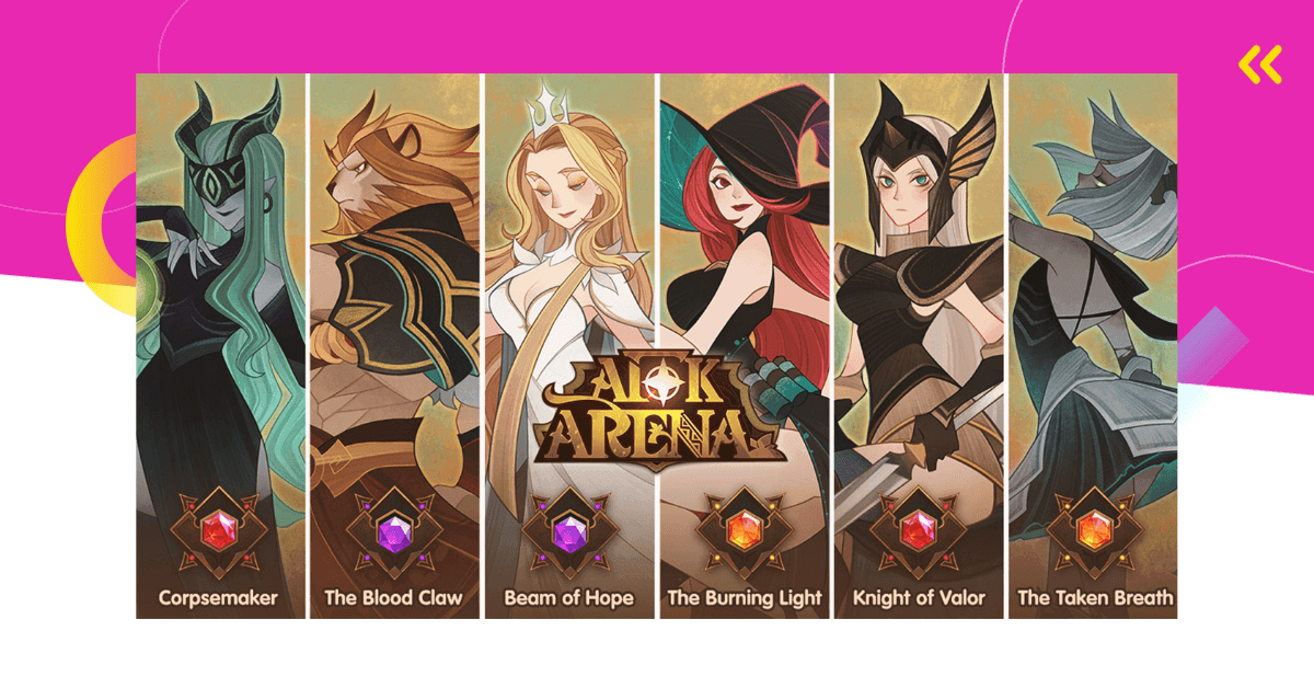
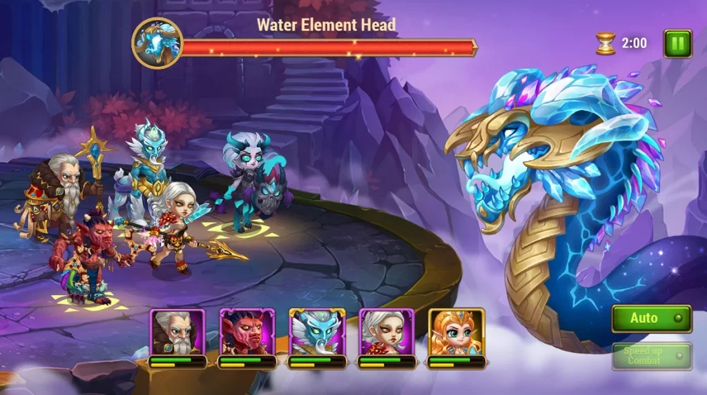
Released globally in April 2019, Lilith Games’ AFK Arena is a squad role-playing game with a mix of idle RPG and turn-based RPG mechanics. It’s based around 5v5 battles that are automated and don’t require much input.
However, even though the combat itself is not strategic, players can choose the hero and faction, and manually activate special skills during battles. (There are 100 heroes and 7 factions available). The passivity of this game is what makes it great for mobile play.
Even though it’s a mid-core game, the core loop is very simple – battle to receive rewards and then use them to expand and upgrade your squad.
There’s also a storyline players progress through. Players need to complete daily and weekly quests. Furthermore, there are guild events and limited-time events. Players can also enjoy a new PvP mode where players battle One-V-One as well as a match-3 game mode called The Wondrous Pouch that was introduced in back in December 2020.
A big part of this game are character collection, idle rewards, a variety of store offers, and gacha mechanics, all of which ties into AFK Arena’s monetization strategy.
How Successful Is AFK Arena?
To find out more about AFK Arena’s performance, I’ve put together extensive data. I cover important KPIs like downloads and revenue.
Unless stated otherwise, the data in this article comes from AppMagic, our data partner.
AFK Arena Downloads and Revenue
Unless stated otherwise, the data in this article comes AppMagic, a mobile intelligence platform. Get 3 days of free access to all AppMagic’s features, as well as 10% off, by clicking this link.
Lilith Games is among the rare few Asian developers that managed to penetrate the US market. The US has the biggest download share, while China is in second place. Other markets AFK Arena does well in are Russia, South Korea, Brazil, and Germany.
So far, AFK Arena has been downloaded more than 45 million times.
In terms of both downloads and revenue (more on that later), AFK Arena peaked back in January 2020 when it reached almost 5 million downloads and $80 million in revenue.
By the end of 2020, that number went to less than 1 million downloads and in 2022, it was between 200 and 400 thousand downloads per month. It’s clear that AFK Arena is getting less and less popular. However, because this game still has a decent number of new users coming in and manages to monetize its existing loyal fanbase, it’s still considered to be quite successful.
Let’s talk more about its revenues.
So far, AFK Arena reached almost $1 billion in all-time revenue. Now that’s impressive. What’s more, if we take a look at its RpD (lifetime revenue divided by lifetime downloads), it’s incredibly high. More specifically, AFK Arena’s global RpD is $22,1, Tier 1 West RpD is $24,27, and Tier 1 East RpD is $53,54!
Furthermore, the latest data from 2022 shows that the game’s monthly revenue didn’t go below $10 million since July, which is another great sign.

AFK Arena Analysis: User Acquisition Strategy
In this section of our AFK Arena analysis, you’ll learn more about this game’s user acquisition and advertising strategy.
Soft Launch
During soft launch (June 2018 – March 2019), AFK Arena acquired 1.4 million downloads and $2.6 million in revenue. The key soft launch markets were Russia (18% of soft launch downloads), Brazil, Vietnam, the Philippines, and Indonesia.
AFK Arena user acquisition efforts increased in January 2019, three months before global release, which increased downloads.
The game’s competitors targeted different markets during the soft launch. For example, Raid: Shadow Legends targeted markets like Ukraine and Germany, and Seven Deadly Sins soft-launched in Japan and South Korea.

Above, you can see early creative strategy during soft launch in Russia. The ads were a mix of real and somewhat misleading content. It featured a lot of creatives where hero characters evolve and get more powerful. In some of the later creatives, we also see character evolution as well as one character fighting against huge mobs, which is not a part of the gameplay.
It’s important to note that many top-performing creatives at this stage didn’t show actual gameplay footage of battles.
About 40% of creatives were video ads, while 60% were banner ads.
AFK Arena Analysis: 10 Top-Performing Creatives
In this section, I’m going to analyze the current top-performing creatives for AFK Arena.
This game uses AdMob, Facebook, Snapchat, Mopub, and Youtube for advertising the most.
AFK Arena Ad #1
In the ad above, we can see that the misleading content where one character battles a whole army of enemies has continued post-global launch as well.
This is not what the game is about.
As mentioned before, AFK Arena is based on 5V5 automated battles that don’t look nearly as cool as this ad.
However, one powerful character defeating hundreds of enemies looks much more satisfying and exciting to watch, which is probably why it was included in the ad.
As always, with misleading creatives, the danger lies in disappointing the players once they download the game.
AFK Arena Ad #2
The ad you see above is just 6 seconds long, which is unusual for a mobile game creative. It’s more like an animated banner ad. That’s very creative and interesting, as you get the best of both worlds.
It’s nicely designed – there’s an animated character (Flame Weaver Satrana) on the left and writing on the right. Due to the diagonal composition, the eye is first drawn to the character and then the attention moves to the right, following the diagonal lines.
In the text portion, there’s the character name, a code for 30 free summons, and a “Get for free” call-to-action.
The concept behind this ad is quite simple – introduce a character and offer free rewards. It’s enough to make viewers interested in the game.
AFK Arena Ad #3
This is another version of the previous concept. It shows you that you can (and should) create many variations of the same creative idea.
This concept can be made into dozens of ads – each one can feature a different character. The reward and call-to-action can remain the same.
AFK Arena Ad #4
This ad is also all about the rewards. However, there’s a real person in this one, which is a great choice. Viewers tend to connect more to other humans. Having a charming woman explain how to use gift codes to get rewards is much more effective than simply featuring game characters.
AFK Arena Ad #5
What makes this AFK Arena ad unique is that it looks like a regular TV commercial. The people in the ad look like friends or work colleagues. A woman walks in and asks a group of guys are they playing AFK Arena too?
Turns out they do and tell her about the heroes they’ve collected.
But then we find out she has the best heroes and they’re maxed out. When the guys ask her how she got so good, the woman explains she started the game with 30 summons and how that affected her gameplay.
We also see some gameplay footage at the end, which is refreshing.
While this video is a bit cringy due to subpar acting, it does offer some social proof. Furthermore, it speaks to the female audience. As we have learned, about 26% of AFK Arena’s users are women. It makes sense to target this large audience of players.
Additionally, these people look like busy professionals – this is another group Lilith Games targets with this type of ad. And they’re targeting people that belong to different age groups. Three people in the video look like they might be in the 25-34 age group and the fourth person might fall into the 45-54 age group.
AFK Arena Ad #6
This short, 6-second split-screen creative has one purpose – to demonstrate idle RPG aspects of the game.
On the left side we see autoplay, and on the right, a busy professional. As he’s working, his levels in the game are going up.
It’s a simple, but effective way to show that players can advance in the game even when they’re not playing.
AFK Arena Ad #7
The ad above also demonstrates the idle and AFK nature of the game. This is represented as the game’s main benefit and USP, something that makes it special. The ad says, “Going AFK saves you time. You level up faster!”, as we see Brutus casually lounging in a beach chair next to the ocean.
AFK Arena Ad #8
While other creatives focus on one game feature, this one demonstrates all of them. It’s more like an app promo video or a game tutorial. The narrator explains everything players need to know about this game, including many features and benefits.
Notice there are captions for users who watch on mute, which is very important.
There’s even some real gameplay footage in this ad – it shows players what the game actually looks like.
The end of the video features the game’s main slogan AFK and chill – a reference to Netflix and chill. It’s top-notch branding.
AFK Arena Ad #9
A great way to stand out from the crowd and hook people in right from the start is to draw on meme culture influences.
This is exactly what Lilith Games did for this AFK Arena ad. It’s an attention grabber right from the start.
The purpose of this creative is to explain the main elements and benefits of this game with a focus on heroes.
Here’s what we learn:
- Leveling up heroes is easy in AFK Arena
- Players who download now will get 10 free heroes (1 legendary hero is guaranteed)
- Players can level up while being idle
- Heroes can be reset
There’s a narrator (with subtitles) that guides viewers through these features, which are also presented through gameplay footage.
In the end, we see the AFK and chill logo. The CTA is a simple “Play now for free!”.
AFK Arena Ad #10
The last top-performing creative I wanted to include also includes actors, just like some of the previous ones I analyzed.
We see two men, I’m guessing in their late 20s or early 30s, casually dressed.
As they approach each other, we see different characters animated behind them. However, the guy on the right comes with a crew of five awesome AFK Arena heroes.
The guy on the left is impressed and asks, “How did you get so many heroes. Did you spend it on microtransactions?”.
The guy on the right answers, “Nope, I’m playing AFK Arena. I get free heroes and lots of stuff.”
At the end of the video, there’s a catchy slogan, “AFK Arena, the best RPG for busy you”.
With this type of creatives, it’s obvious Lilith Games wants to position AFK Arena as a game that’s perfect for busy professionals, just like in some other creatives. Furthermore, they’re targeting their main audience – men aged 25-34.
The concept of the ad is very creative. It stands out from competitor’s ads, which is not easy considering how saturated the market is.
AFK Arena Analysis: App Store Optimization
To finish off our AFK Arena Analysis, let’s go through the main elements of this game’s app store pages. As you probably know, well-optimized app store pages increase a game’s visibility and thus aid organic user acquisition.
Since AFK Arena doesn’t have an app promo video, I’ll focus on the game title, icon, and screenshots
Game Title
AFK Arena is a cool and memorable name that references an old school internet acronym – away from keyboard. As it was mentioned before, this game allows players to level up their heroes and gain rewards while being “away from keyboard”, which makes it a fitting name.
![]()
Game Icon
AFK Arena features game characters. More specifically, Elijah & Lailah, celestial twins. According to AFK Arena Wiki, “They are intelligence-based support heroes of the celestial faction. Elijah specializes in restoring the health point of his allies, while Lailah focuses on their energy points.”
Just like the game, the art style is 2d anime. Since the depicted characters are twins, who are like yin and yang, it creates a nice symmetry for the icon, which makes it very visually appealing. Color-wise, the icon is mostly gold, except for the pop of green and pink we see in the hair, which creates a beautiful contrast.
![]()
Note that AFK Arena’s icon went through some changes, as you can see in the image above.
During the soft launch, it was a close-up of Brutus, a key character in the game. The icon introduced in March 2019 is a bit more abstract. It’s unsure whether it’s a close up of an actual character or a digital drawing of an eye.
Furthermore, AFK Arena had different temporary icons during different holidays like Halloween.
The game icon we see now was introduced in June 2020.

Images
Just like the icon, AFK Arena’s images went through some changes as well. Above, you can see how different they were during the soft launch, post-launch, and October 2020.

Here you can see how they look now.
AFK Arena’s Google Play and App Store images are nicely designed and present main game features and lots of characters. However, just like most ads, they don’t depict actual gameplay – except for one.
AFK Arena Analysis: 3 Things You Can Learn From This Game

1. Demonstrate Game’s Best Features & Benefits in Ads
As we have learned from AFK Arena’s ads, in order to attract new users, developers need to advertise the game in an appealing way.
Most importantly, that means demonstrating specific game features and benefits in video creatives. People want to see different aspects of gameplay as it relates to the game’s genre.
It’s best to focus on just one feature/benefit per ad.
Here’s why.
Most games attract a couple of different gamer audiences, so it’s important to create ads around specific gamer motivations.
Let’s use AFK Arena as an example.
One audience this game appeals to is gamers who love idle RPGs. Another audience is gamers who love the collecting aspect of RPGs (in AFK Arena’s case, it’s all about collecting heroes).
Thus, it makes sense to create ads for the first audience that demonstrate this game is perfect for busy people who enjoy idle games. For the second audience, it makes sense to showcase different characters (heroes), ways to collect them, and how that influences the game.
Simple, right?

2. Make Sure the Ads Speak to Target Demographics
Another way to appeal to a certain audience is to create ads based on your audience’s gender, age, behavior, etc.
As we have seen with AFK Arena, the age, gender, and behavior of people in ads correspond to the game’s target demographic.
We saw busy professionals, people in the 25-34, 35-44, and even 44-54 age groups, both women and men, etc.

3. Include More Gameplay in Ads
Now, this is something Lilith Games rarely do for AFK Arena. However, we advise you to include at least some gameplay footage in ads.
Yes, cinematics might look way cooler. But including actual gameplay in your creatives shows people the actual game experience and avoids any disappointment once they download the game.
Final Thoughts on AFK Arena
Hopefully, our AFK Arena analysis shed some light on this game and what made it so popular. Use these findings to improve the user acquisition strategy for your game.
If you need help, make sure to reach out. Mobile game marketing is what we do best!


